Continuous Plots
This app allows you to quickly make and customize plots visualizing continuous variables, with or without another grouping variable.
What kind of plots do we have?
Currently, this app supports the following types of plots:
Box Plots
Violin Plots
Histograms
Scatter Plots
Bar Plots
Mosaic Plots
Density Plots
Pie Charts
Column Plots
Bubble Plots
Cumulative Mean Plots
Cumulative Median Plots
Cumulative Proportion Plots
How to use this app?
To make your own plots, make sure you have your dataset in .csv format and simply follow the instructions below.
1. Upload your data
2. Select which variables to plot
3. Select the plot type
4. Customize plot options and labels
5. Use the download button to save your plot
Contact us
Please contact us if you have any questions at datascience@colgate.edu.
Tutorial
On this page, you'll find all the necessary details about the plots within this app.
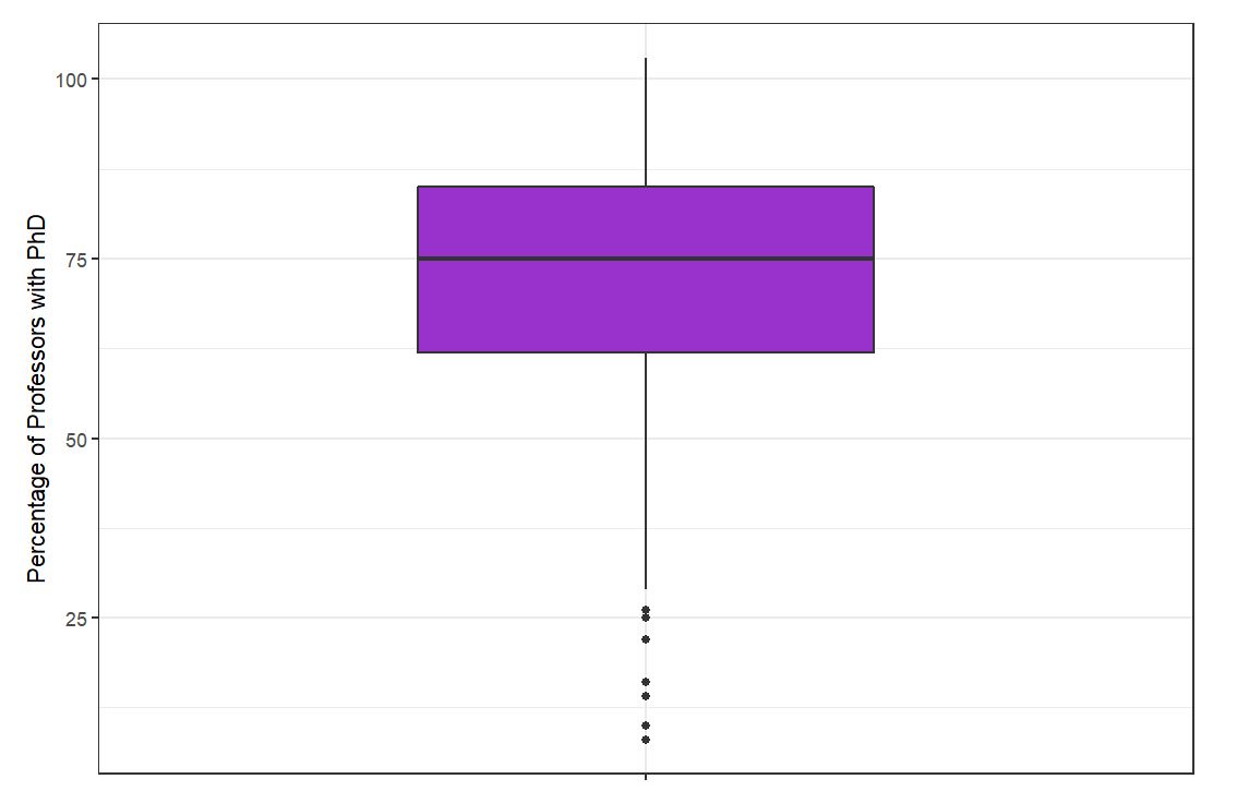
Box Plot
Box plots visually show the distribution of numerical data and skewness through displaying the data quartiles (or percentiles) and averages.
Variable: Quantitative
Optional grouping: Categorical
Column Plot
A column plot is a chart that presents data summaries with rectangular bars with heights proportional to the values that they represent.
Variable: Quantitative
Optional groupin: Categorical
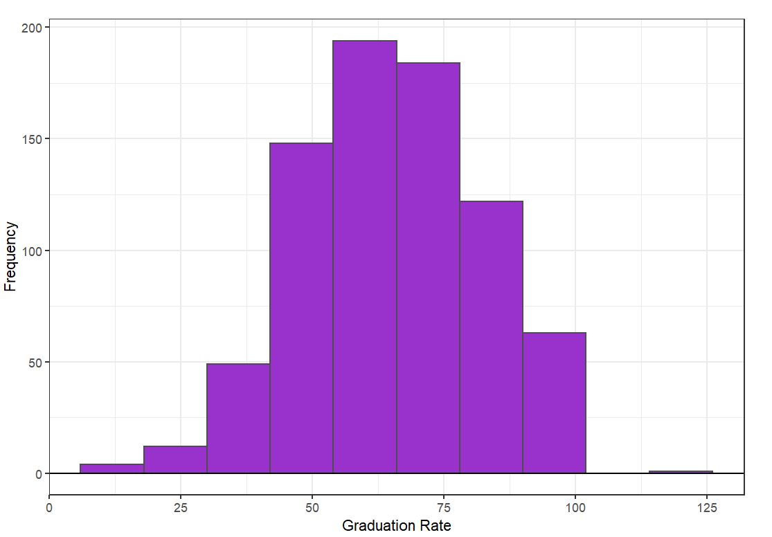
Histogram
A histogram is an approximate representation of the distribution of numerical data.
Variable: Quantitative
Optional grouping: Categorical
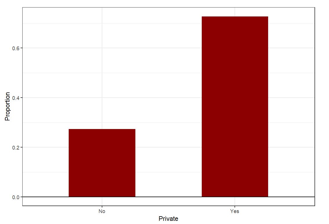
Bar Plot
A bar plot is a chart that presents categorical data with rectangular bars with heights or lengths proportional to the values that they represent.
Variable: Quantitative
Optional grouping: Categorical
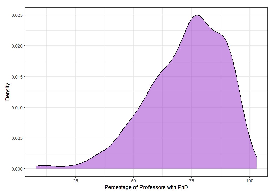
Density Curve
A density curve is a curve on a graph that represents the distribution of values in a dataset.
Variable: Quantitative
Optional grouping: Categorical
Tutorial
On this page, you'll find all the necessary details about the plots within this app.
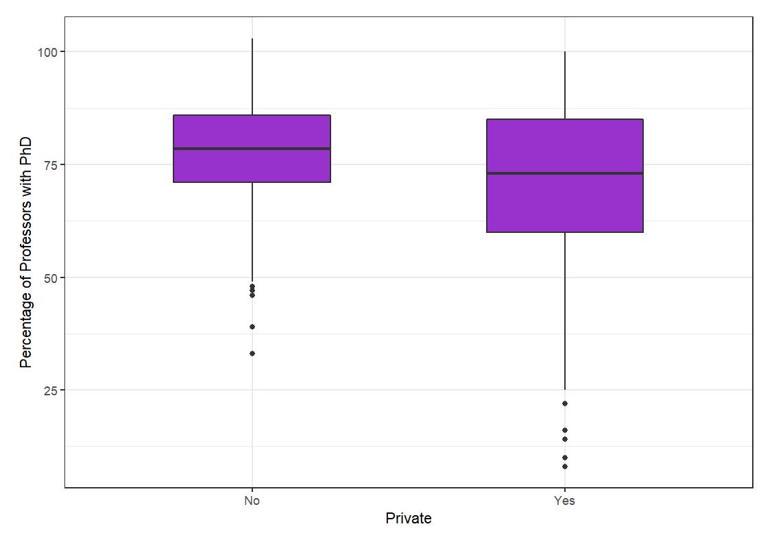
Box Plot
Box plots visually show the distribution of numerical data and skewness through displaying the data quartiles (or percentiles) and averages.
Variable: Quantitative
Optional grouping: Categorical
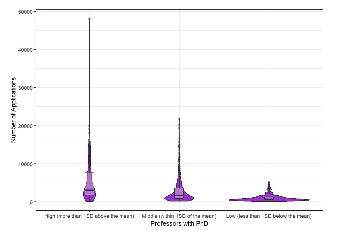
Violin Plot
A violin plot is a method of plotting numeric data. It is similar to a box plot, with the addition of a rotated kernel density plot on each side. Violin plots are similar to box plots, except that they also show the probability density of the data at different values, usually smoothed by a kernel density estimator.
Variable: Quantitative
Grouping: Categorical
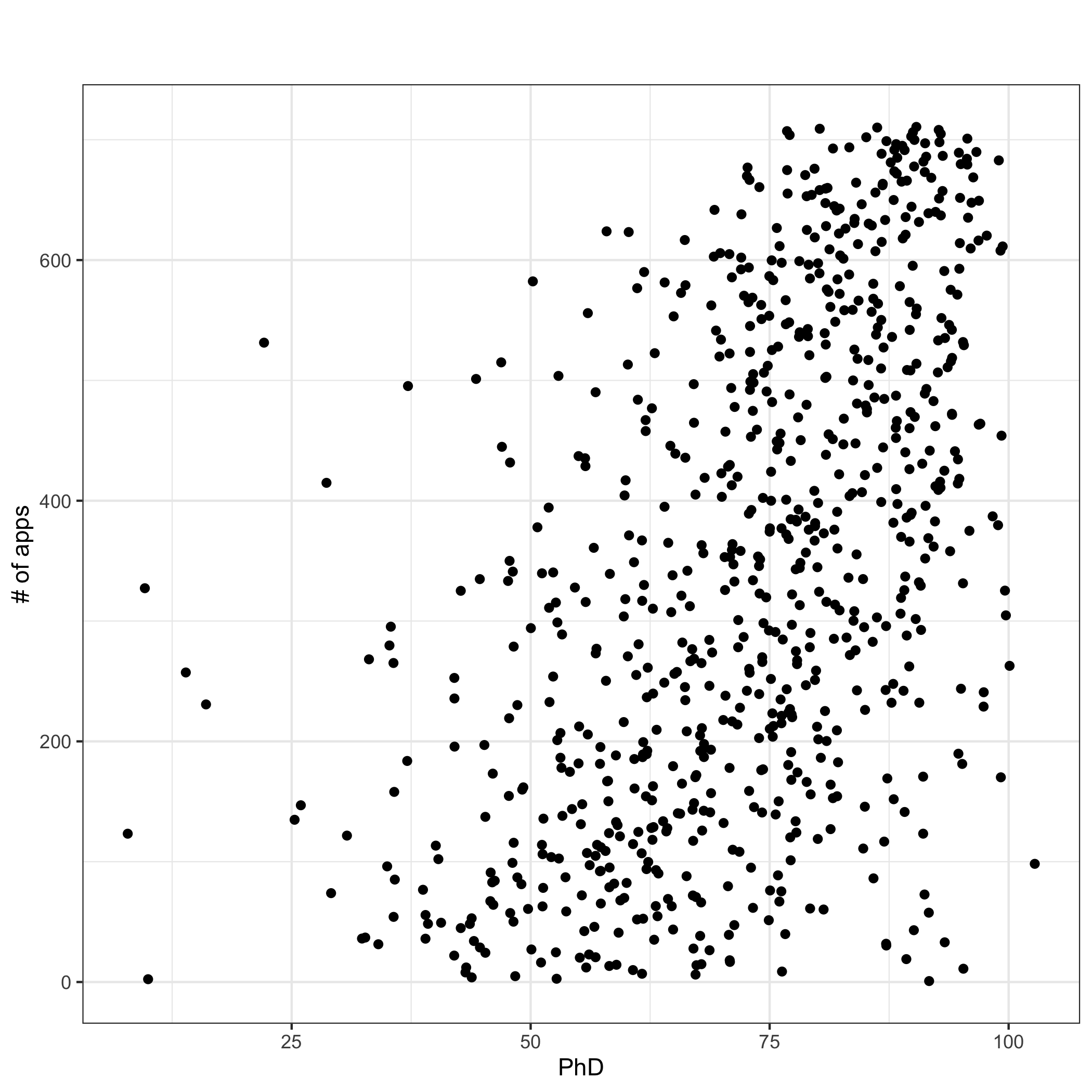
Scatter Plot
A scatter plot (aka scatter chart, scatter graph) uses dots to represent values for two different numeric variables. The position of each dot on the horizontal and vertical axis indicates values for an individual data point. Scatter plots are used to observe relationships between variables.
X variable: Quantitative
Y variable: Quantitative
Mosaic Plot
A mosaic plot is a special kind of stacked bar plot that shows percentages of data in groups such that each stack is of length 1.00.
Variable: Categorical
Grouping: Categorical

Tutorial
On this page, you'll find all the necessary details about the plots within this app.
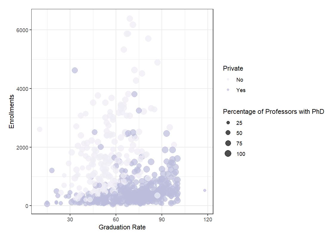
Bubble Plot
A bubble plot is a scatterplot where two more dimensions are added: 1) the value of an additional numeric variable is represented through the size of the dots 2) the categorical variable is represented through the color of the dots
X variable: Quantitative
Y variable: Quantitative
Size variable: Quantitative
Optional color variable: Categorical
